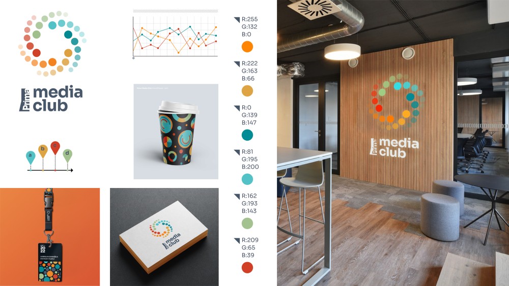
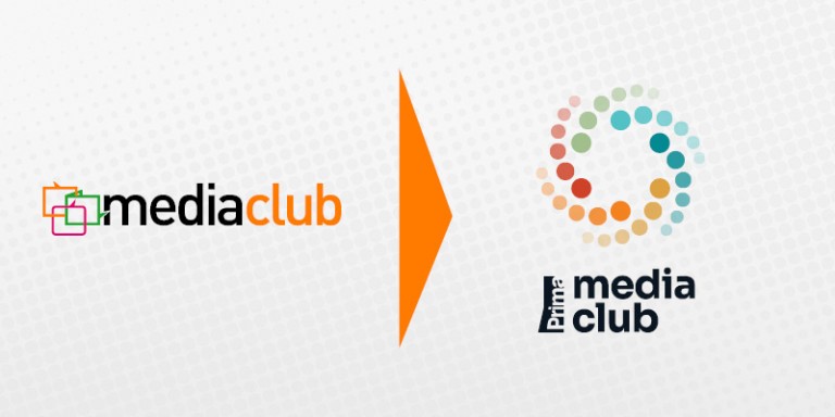
After nine years, the media agency Media Club is changing its logo and its graphic design. The new symbol, the used colour palette and the added Prima logo synergistically reflect the key attributes of the Prima Group. Behind the look is the audiovisual studio Department, headed by Michal Pacina, who have been involved in shaping the visual identity of the Prima Group and its programmes since 2014. The authors have imprinted the dynamism of the times into the graphics, but they also playfully work with colourful graphs that symbolise the planning and reporting of media campaigns.
"The change in visual identity reflects the growth of Media Club's media representation. The original logo from 2013 only worked with the symbols of TV, radio and web. The new design takes into account the expansion of Prima Group's media types to include social networks and prints, while reflecting the possibilities of collaboration in the field of events. The new logo in the form of a colourful 'galaxy' also symbolises the dynamism of the times and the synergistic linking of the individual brands of the Prima family,"
says Aleš Pýcha, Marketing Director of the Prima Group.
The font of the Media Club dealership has also been given a graphic refresh, with Studio Department opting for the freely available Sora font. The new graphic identity will be gradually reflected in all marketing materials of the Media Club, including communication on social networks.

Media Club has been active on the Czech market since 2013 and currently represents over forty media outlets, which enables it to reach 100% of the Czech economically active population. The strengths of Media Club are the strong background of the Prima Group and a team of experienced media consultants who, thanks to their professional work with data and analysis, are able to segment target groups and effectively plan media campaigns across various media types, from TV or radio stations, internet websites, print media to social networks.
Source: media-club.tv


