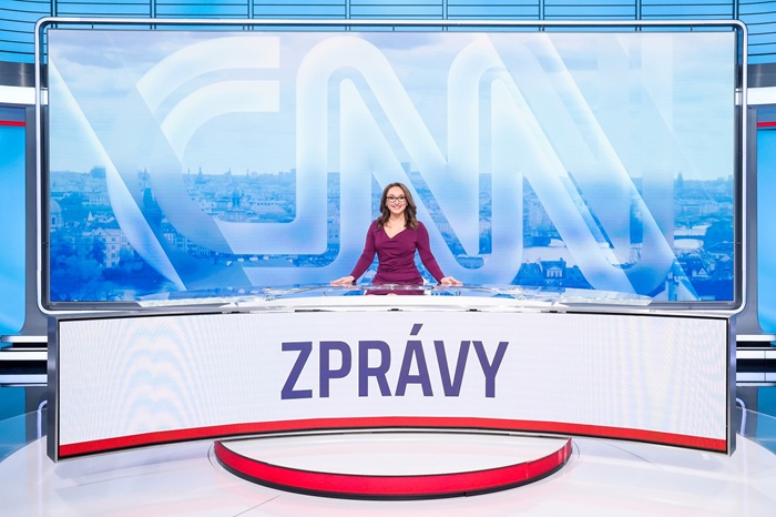
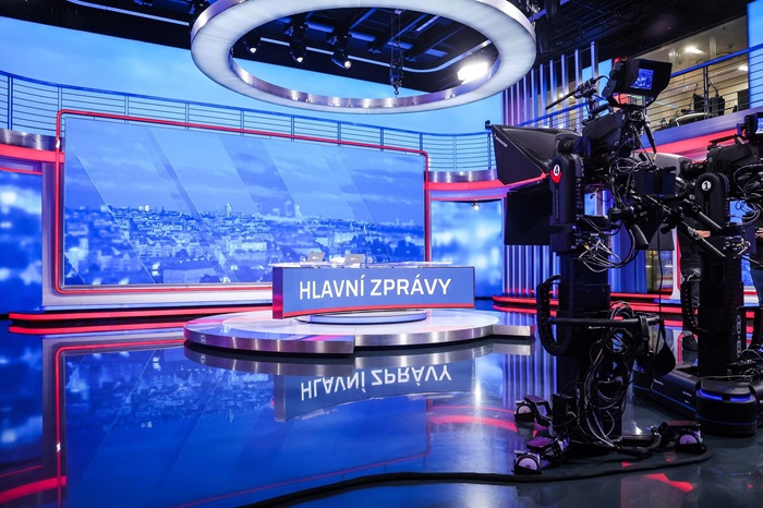
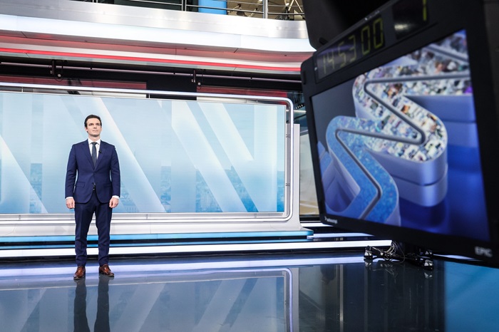
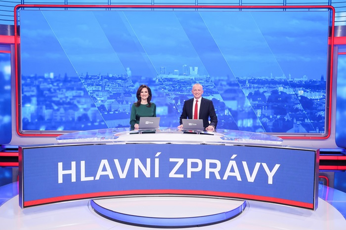
Starting Sunday, February 18, CNN Prima News will introduce a new graphic design. The changes affect the Main News, Continuous News, Sports and Weather sessions. The changes include a new concept of the studio, including the jingles of each programme.
The graphic changes have been fine-tuned by the team of the head of the graphics department Petr Závorka in cooperation with the editorial office and the American CNN for several months with an emphasis on clarity and current trends in the world of television news. The new graphics are designed to help explain complex news topics in the simplest possible way.
"We have long said that in CNN Prima News we don't just want to state what's happening in a stark way, but we want to explain to viewers why it's happening, and most importantly - how it will affect their lives. That's why we have spent the last few months focusing on the graphic design of our news programmes. To make the graphics clearer, more concise and more transparent for viewers, so that we can present and explain even complicated topics in an attractive way, but which have a major impact on our lives,"
said Tomáš Vojáček, CNN Prima News' editor-in-chief of news and journalism.
 The new CNN Prima News studio; Source: FTV Prima
The new CNN Prima News studio; Source: FTV Prima
 The new CNN Prima News studio; Source: FTV Prima
The new graphic design is based on the concept that CNN Prima News used for its election specials last year.
"Viewers will see the full benefits and possibilities of the connection with CNN in our broadcast dedicated to the US presidential election, but it will also be strongly infused into our daily newscasts and other special projects," Vojáček says.
As a result, the graphic innovations will also appear in a number of special broadcasts during this super-election year.
The jingle of the continuous newscast now uses the CNN logo hiding thumbnails of news from home and around the world. All studio graphics have also undergone a noticeable facelift. "In our projections in the new CNN Prima News graphic design, we have switched to full screen LED, which means the graphics now cover the entire screen for maximum impact. At the same time, we have introduced a lighter colour palette, which improves readability and contributes to the overall accessibility and clarity of the presented content," described Petr Závorka, Head of Graphics at CNN Prima News.
The Sports jingle leans towards minimalism, with balls and a puck as the main symbols, as a reference to the most popular disciplines in the Czech Republic.
Weather has also been changed. The new jingle works with a virtual transparent cube, in which the "unbridled elements affecting the everyday life of all of us" gradually alternate.
Source: mediaguru.cz
Source: mediaguru.cz

